As a writer, you pour your heart and soul into crafting a chapbook that resonates with your audience. But when it comes to laying out your chapbook, even the smallest mistakes can detract from the overall impact of your work. Don’t worry – we’ve all been there! In this post, we’ll explore some common chapbook layout mistakes and provide you with actionable tips to avoid them.
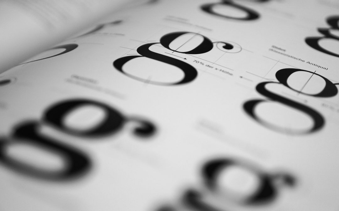
Typography Troubles
Typography is an essential aspect of chapbook design, and getting it wrong can be disastrous. Here are a few common typography troubles to watch out for:
- Using too many fonts: Stick to a maximum of two to three fonts throughout your chapbook. Too many fonts can create visual clutter, making it difficult for readers to focus on your content.
- Inconsistent font sizes and styles: Ensure that headings, subheadings, and body text are consistent in terms of font size, style, and spacing.
- Insufficient line spacing: Make sure there’s adequate line spacing (at least 1.2-1.5 times the font size) to allow readers to easily scan your text.
Using a tool like Vellum or Canva can simplify the process of selecting and applying typography to your chapbook.
Pagination Pitfalls
Pagination is another critical aspect of chapbook layout that can either enhance or detract from your content. Here are some common mistakes to avoid:
- Incorrect page margins: Ensure that your margins are adequate (at least 0.5-1 inch) to prevent text from getting too close to the edge of the page.
- Inconsistent page layouts: Use a consistent page layout throughout your chapbook to create a visually appealing and cohesive look.
Take a look at our post on Ways to Format Your Chapbook for more in-depth information on pagination and other chapbook design elements.
Physical Production Issues
When it comes to physically producing your chapbook, there are several things to consider to avoid production issues:
- Choosing the wrong paper weight: Ensure that your paper weight is adequate (at least 80-100 gsm) to prevent it from feeling flimsy or too thin.
- Inadequate binding methods: Choose a binding method that suits your chapbook’s size and content, such as saddle-stitching, stapling, or perfect binding.
Remember, the physical production of your chapbook is an extension of your content, so it’s crucial to get it right.
Design is not just about making the page look pretty. It’s about creating an immersive experience that draws the reader in and never lets them go.
By avoiding these common chapbook layout mistakes, you’ll be well on your way to creating a professional-looking chapbook that showcases your talent and creativity. Remember, design is an iterative process, and it’s okay to make mistakes along the way. The key is to learn from them and continually improve your craft.
If you’re just starting out, consider checking out our post on Write Your Book in 30 Days for more guidance on the writing and publishing process. And if you’re interested in learning more about DIY book design, take a look at our article on Fatal Errors in DIY Book Design.
With patience, practice, and the right guidance, you’ll be creating stunning chapbooks that resonate with your audience and leave a lasting impression. Happy writing and designing!