As writers, we’re often so focused on crafting the perfect words that we forget about the importance of presentation. When it comes to chapbooks, design can make or break the reader’s experience. A well-designed chapbook can elevate your work, while a poorly designed one can detract from it. In this post, we’ll explore the essential chapbook design mistakes to avoid, so you can create a beautiful and professional-looking book that showcases your writing.
Typography and Font Choices
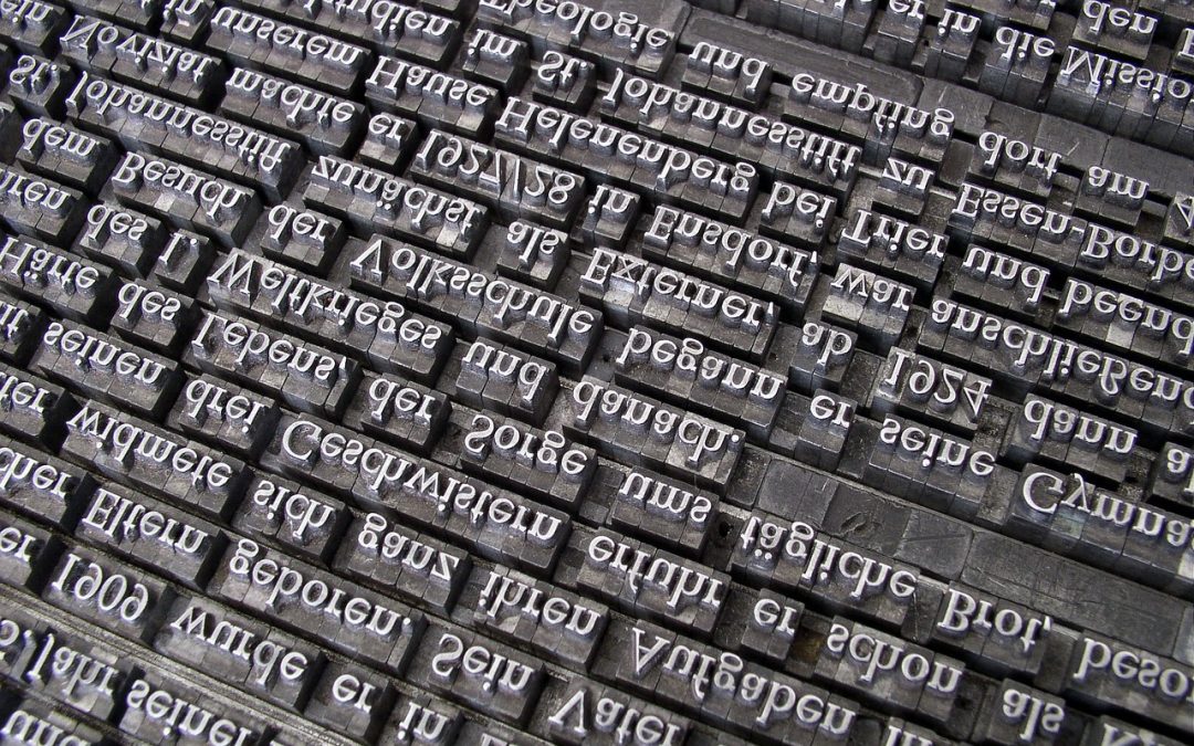
Typography is one of the most crucial aspects of chapbook design. The right font can create a specific mood or atmosphere, while the wrong one can be distracting or even unreadable. Here are a few common mistakes to avoid:
- Using too many fonts: Stick to 2-3 fonts maximum, and make sure they complement each other.
- Choosing fonts that are too similar: Make sure there’s enough contrast between your title font and body font.
- Using fonts that are too ornate or decorative: Unless you’re going for a specific aesthetic, stick to clean and simple fonts.
When it comes to font choices, it’s essential to consider the tone and mood you want to convey. For example, a serif font like Garamond can create a classic and elegant feel, while a sans-serif font like Helvetica can create a modern and sleek look. Experiment with different fonts to find the perfect fit for your chapbook.
Layout and White Space
A well-designed chapbook should have a clear and consistent layout. This includes the use of white space, margins, and gutters. Here are a few mistakes to avoid:
- Not leaving enough white space: Make sure to leave enough room between lines of text and around images.
- Not using margins: Margins help create a clear and defined space for your text and images.
- Not considering the gutter: The gutter is the space between the two facing pages of a book. Make sure to leave enough room for the gutter, especially if you’re using a binding method like perfect binding.
When it comes to layout, it’s essential to consider the flow of your chapbook. You want the reader to be able to easily navigate through your work, without feeling overwhelmed or confused. Experiment with different layouts and designs to find the perfect fit for your chapbook.
Cover Design and Materials
The cover of your chapbook is the first thing readers will see, so it’s essential to make a good impression. Here are a few mistakes to avoid:
- Using low-quality images: Make sure your cover image is high-resolution and clear.
- Not considering the paper type: Choose a paper type that complements your design and feels premium in the reader’s hands.
- Not adding a clear title and author name: Make sure your title and author name are clear and easy to read.
When it comes to cover design, it’s essential to consider the overall aesthetic you want to create. You can use design tools like Canva or Vellum to create a professional-looking cover. Don’t be afraid to experiment and try out different designs until you find the perfect fit.
“Design is not just what it looks like and feels like. Design is how it works.” – Steve Jobs
This quote from Steve Jobs highlights the importance of considering both form and function when it comes to design. A well-designed chapbook should not only look beautiful, but also be easy to read and navigate.
If you’re new to chapbook design, it can be overwhelming to know where to start. That’s why it’s essential to take your time and experiment with different designs and layouts. Don’t be afraid to make mistakes – they’re an essential part of the design process. For more tips on DIY book design, check out our post on DIY Book Design: Top 5 Mistakes to Avoid.
By avoiding these common chapbook design mistakes, you can create a beautiful and professional-looking book that showcases your writing. Remember to take your time, experiment with different designs, and consider the overall aesthetic you want to create. With patience and practice, you can create a chapbook that you’ll be proud to share with readers. And if you’re looking for more inspiration and guidance on the self-publishing process, be sure to check out our guide to Write, Design, Publish Repeat.
Happy designing, and I’ll see you in the next post!