
by Susan Sondheimer | Blog
So you’ve finally decided to take the plunge and self-publish your work! Congratulations on taking the first step towards sharing your writing with others. Self-publishing can seem daunting at first, but trust me, it’s easier than you think. With the right guidance, you can produce a high-quality book that you’ll be proud to call your own.
Why Self-Publishing
In traditional publishing, you’d need to find an agent, wait for months to hear back, and then wait another year or more for your book to finally hit the shelves. With self-publishing, you’re in control. You decide when your book is ready, you format it to your liking, and you get to keep a larger percentage of the royalties. Plus, with the rise of online platforms and social media, marketing and promoting your work has never been easier.
Now, I know what you’re thinking: “But I’m not tech-savvy” or “I don’t know the first thing about book design.” Fear not, my friend. With the right tools and resources, you can create a professional-looking book that rivals any traditionally published book.
Getting Started
Before you start formatting your book, take some time to prepare your manuscript. Make sure it’s edited, proofread, and polished to perfection. You can also take the challenge to Write Your Book in 30 Days. Once you’re happy with your work, it’s time to think about formatting.
For chapbooks, I recommend using a design tool like Canva or Vellum. Both are user-friendly and offer a range of templates and customization options. You can choose from various paper types, including standard 8.5 x 11, square, or even A5 sizes. When it comes to binding, you can opt for perfect binding, stapling, or even a handmade Coptic stitch. The possibilities are endless!
Here are some general tips to keep in mind when formatting your chapbook:
- Choose a clear, readable font, preferably in a serif font family like Garamond or Georgia.
- Keep your margins at least 0.5 inches to ensure there’s enough white space around your text.
- Avoid clutter and keep your design clean and simple.
- Don’t forget to add a table of contents and page numbers!
Common Mistakes to Avoid
As a self-published author, it’s easy to fall into common pitfalls. One of the most common mistakes I see is poor formatting. Make sure to avoid Simple Chapbook Layout Mistakes that can make your book look amateurish. Another mistake is not editing your work thoroughly. Typos and grammatical errors can make your book look unprofessional.
Here’s a motivational quote to keep you going:
“The only way to do great work is to love what you do.” – Steve Jobs
This quote is especially relevant when it comes to self-publishing. Remember why you started writing in the first place? Because you’re passionate about it! Don’t let fear or doubt hold you back from sharing your work with the world.
In conclusion, self-publishing is a journey, not a destination. It takes time, effort, and patience, but the rewards are well worth it. With the right tools, resources, and mindset, you can create a high-quality book that you’ll be proud to call your own. So go ahead, take the leap, and start creating!
by Susan Sondheimer | Blog
As a writer, you pour your heart and soul into crafting a chapbook that resonates with your audience. But when it comes to laying out your chapbook, even the smallest mistakes can detract from the overall impact of your work. Don’t worry – we’ve all been there! In this post, we’ll explore some common chapbook layout mistakes and provide you with actionable tips to avoid them.
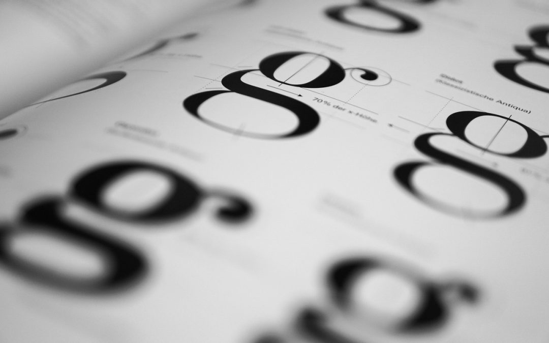
Typography Troubles
Typography is an essential aspect of chapbook design, and getting it wrong can be disastrous. Here are a few common typography troubles to watch out for:
- Using too many fonts: Stick to a maximum of two to three fonts throughout your chapbook. Too many fonts can create visual clutter, making it difficult for readers to focus on your content.
- Inconsistent font sizes and styles: Ensure that headings, subheadings, and body text are consistent in terms of font size, style, and spacing.
- Insufficient line spacing: Make sure there’s adequate line spacing (at least 1.2-1.5 times the font size) to allow readers to easily scan your text.
Using a tool like Vellum or Canva can simplify the process of selecting and applying typography to your chapbook.
Pagination Pitfalls
Pagination is another critical aspect of chapbook layout that can either enhance or detract from your content. Here are some common mistakes to avoid:
- Incorrect page margins: Ensure that your margins are adequate (at least 0.5-1 inch) to prevent text from getting too close to the edge of the page.
- Inconsistent page layouts: Use a consistent page layout throughout your chapbook to create a visually appealing and cohesive look.
Take a look at our post on Ways to Format Your Chapbook for more in-depth information on pagination and other chapbook design elements.
Physical Production Issues
When it comes to physically producing your chapbook, there are several things to consider to avoid production issues:
- Choosing the wrong paper weight: Ensure that your paper weight is adequate (at least 80-100 gsm) to prevent it from feeling flimsy or too thin.
- Inadequate binding methods: Choose a binding method that suits your chapbook’s size and content, such as saddle-stitching, stapling, or perfect binding.
Remember, the physical production of your chapbook is an extension of your content, so it’s crucial to get it right.
Design is not just about making the page look pretty. It’s about creating an immersive experience that draws the reader in and never lets them go.
By avoiding these common chapbook layout mistakes, you’ll be well on your way to creating a professional-looking chapbook that showcases your talent and creativity. Remember, design is an iterative process, and it’s okay to make mistakes along the way. The key is to learn from them and continually improve your craft.
If you’re just starting out, consider checking out our post on Write Your Book in 30 Days for more guidance on the writing and publishing process. And if you’re interested in learning more about DIY book design, take a look at our article on Fatal Errors in DIY Book Design.
With patience, practice, and the right guidance, you’ll be creating stunning chapbooks that resonate with your audience and leave a lasting impression. Happy writing and designing!

by Susan Sondheimer | Blog
Have you always dreamed of writing a book, but struggled to get past the first few pages? You’re not alone. Many writers struggle to make progress on their manuscripts, often getting bogged down in the details or losing momentum. But what if you could write your book in just 30 days? Sounds impossible, right?
Why 30 Days?
The idea of writing a book in 30 days might sound crazy, but it’s actually a great way to boost your creativity, stay focused, and make real progress on your manuscript. By dedicating a set amount of time each day to writing, you can make significant headway on your book without feeling overwhelmed. Plus, having a deadline can help you stay accountable and motivated.
In fact, many famous authors have used this technique to write their books. For example, Ernest Hemingway wrote 500 words a day, while Stephen King has said he writes 2,000 words a day. Of course, you don’t have to write as much as these famous authors, but setting a daily goal can help you stay on track and make progress on your manuscript.
Preparing for the Challenge
Before you start writing, it’s essential to prepare for the challenge ahead. Here are a few things to consider:
-
Set your goal: Decide how many words you want to write each day. This will help you stay focused and motivated. Start with a goal that feels achievable, like 1,000 words a day, and adjust as needed.
-
an outline: Having an outline can help you stay on track and ensure your story flows logically. Don’t worry too much about the details, just focus on the key plot points and character arcs.
-
Choose your tools: You’ll need a few essential tools to help you write your book. Consider using a writing software like Scrivener or Google Docs, and a note-taking app like Evernote or OneNote.
-
Eliminate distractions: Identify potential distractions that might derail your progress, such as social media or email, and find ways to minimize them. Consider using a website blocker or turning off your phone during writing sessions.
Tips for Success
Here are some additional tips to help you succeed in writing your book in 30 days:
“You can’t wait for inspiration. You have to go after it with a club.” – Jack London
-
Write badly: Don’t worry too much about grammar, spelling, or sentence structure on your first draft. Just getting the words out is what matters. You can refine your writing later.
-
Use writing sprints: Break your writing sessions into shorter sprints, like 25 minutes of writing followed by 5 minutes of break. This can help you stay focused and avoid burnout.
-
Get support: Share your goals with a friend or fellow writer and ask them to hold you accountable. This can provide an added motivation to keep going, even when things get tough.
-
Celebrate milestones: Reward yourself for reaching certain milestones, like completing a chapter or reaching a certain word count. This can help you stay motivated and encouraged throughout the process.
-
Format as you go: Consider formatting your book as you go, using software like Vellum or Canva. This can save you time in the long run and ensure your book looks professional. Check out our article on Ways to Format Your Chapbook for more tips.
By following these tips and staying committed to your goal, you can write your book in just 30 days. Remember, it’s not about writing a perfect draft, it’s about making progress and getting your ideas down on paper.
Once you’ve completed your manuscript, you can refine your writing, edit your work, and prepare your book for publication. Don’t forget to check out our resources on book design, including our article on Fatal Errors in DIY Book Design, to ensure your book looks professional and polished.
So, are you ready to take the challenge and write your book in 30 days? With dedication, persistence, and the right tools, you can make your writing dreams a reality.

by Susan Sondheimer | Blog
As a writer, you’ve poured your heart and soul into crafting a chapbook that showcases your unique voice and style. Now, it’s time to bring your work to life by formatting it in a way that’s both visually appealing and easy to read. In this post, we’ll dive into the world of chapbook formatting, covering everything from choosing the right software and paper to binding methods and design.
Choosing the Right Software
One of the most crucial steps in formatting your chapbook is selecting the right software. You’ll want to choose a program that allows you to design and layout your book with ease. Some popular options include:
- Vellum: A user-friendly, Mac-based program specifically designed for book formatting. It offers a range of templates and customization options to help you achieve a professional-looking chapbook.
- Canva: A cloud-based graphic design platform that’s also great for book formatting. With its intuitive interface and extensive design elements, you can create a stunning chapbook in no time.
- InDesign: A powerful, industry-standard design software that offers advanced features for book formatting. While it may have a steeper learning curve, it’s an excellent choice for those willing to invest time in mastering its capabilities.
Regardless of the software you choose, it’s essential to familiarize yourself with its features and functions. Take some time to explore, experiment, and watch tutorials to become proficient in using it.
Designing Your Chapbook Interior
You’ve got your software, and now it’s time to start designing the interior of your chapbook. This involves deciding on the layout, font styles, and overall aesthetic that best suits your content. Some things to consider:
- Font choice: Select a font that complements your writing style and is easy to read. You may want to choose a serif font for body text and a sans-serif font for headings.
- Line spacing: Ensure your lines are well-balanced to avoid overwhelming the reader. A good rule of thumb is to use 1.5 to 2 times the font size for line spacing.
- Margin sizes: Leave adequate margins (at least 0.5 inches) to create a visually pleasing and readable chapbook.
- Section breaks: Use section breaks to separate your poems or stories and create a clear flow throughout the book.
“Design is not just what it looks like and feels like. Design is how it works.” – Steve Jobs
Binding and Materials
Now that you’ve designed the interior of your chapbook, it’s time to think about the binding and materials. This can be a fun and creative process, and there are many options to choose from:
- Paper type: Select a high-quality paper that suits your content. For example, a smooth finish is ideal for poetry, while a textured finish may work better for short stories.
- Binding methods: You can opt for a simple stapled or saddle-stitched binding, or even try your hand at DIY book binding methods (check out our post on DIY Book Binding Methods to Try Today for inspiration).
- Cover design: Design a cover that reflects the tone and theme of your chapbook. You can use a photo, illustration, or even create a hand-drawn design.
Remember, the binding and materials you choose should complement your chapbook’s content and overall aesthetic.
Final Touches and Proofreading
Congratulations! You’ve made it to the final stage of formatting your chapbook. Before you’re ready to share it with the world, take some time to:
- Proofread: Carefully review your chapbook for errors in formatting, grammar, and punctuation.
- Get feedback: Share your chapbook with fellow writers or mentors to gather constructive feedback and suggestions.
- Check the essentials: Ensure you’ve included all the essential pages in your chapbook, such as a title page, table of contents, and acknowledgments (check out our post on Chapbook Magic: 10 Essential Pages for more information).
By following these steps and taking the time to carefully format your chapbook, you’ll be proud to share your work with others. Remember, formatting is an essential part of the self-publishing process, and it’s worth investing the time and effort to get it right.
Happy formatting, and don’t forget to enjoy the process of bringing your chapbook to life!

by Susan Sondheimer | Blog
As indie authors, we wear many hats – writer, editor to designer, and publisher. While designing your book can be an exciting part of self-publishing, it’s also where many of us stumble. With so many tools and software available, it’s easy to get caught up in the creative process and overlook some fatal errors in DIY book design. In this post, we’ll explore common mistakes to avoid, tips to improve your design, and resources to help you create a professionally designed book that will make readers swoon.
Typography Traps
One of the most crucial design elements is typography. The right font choice can make or break the reading experience. However, with so many fonts available, it’s easy to fall into some common typography traps. Here are a few to avoid:
- Too many font styles: Stick to 2-3 font styles maximum. Any more, and your book will start to look like a ransom note.
- Inconsistent font sizes: Ensure your headings, subheadings, and body text are consistent throughout the book. Use a clear hierarchy to guide the reader’s eye.
- Incorrect font alignment: Make sure your text is aligned correctly. Flush left for body text and flush right for headings usually work best.
For a more detailed guide on typography, check out Write, Design, Publish: Your Book’s Journey, where we dive deeper into the world of typography.
Designing for Digital vs. Print
When designing your book, it’s essential to consider whether you’re creating a digital-only or print book. The design elements will differ significantly between the two. Here are some key factors to keep in mind:
- Resolution: Digital books require a much lower resolution (72 dpi) compared to print books (300 dpi).
- Color mode: Digital books use RGB, while print books use CMYK.
- Trim size: Ensure your design is optimized for the trim size you’ve chosen. A 6×9 inch trim size will have different design requirements than an 8.5×11 inch trim size.
For chapbooks, it’s essential to consider the physical constraints of the book. Chapbook Magic: 10 Essential Pages explores the unique challenges and opportunities of chapbook design.
Common Design Mistakes
Beyond typography and digital vs. print considerations, there are some common design mistakes that can make your book look amateurish:
- Over-designing: Less is often more. Avoid cluttering your pages with too many elements.
- Inadequate margins: Leave enough whitespace around your text to make it easy to read.
- Low-quality images: Ensure any images you use are high-resolution and relevant to the content.
As the famous designer, Dieter Rams, once said:
Design is so simple. That’s why it’s so complicated.
Remember, good design is about creating a seamless reading experience. It’s not about showcasing your design skills (although, let’s be honest, it’s nice to get some design kudos too!).
Finally, don’t be afraid to experiment and try new design tools and software. From Vellum to Canva, there are many tools available to help you create a professionally designed book. And if you’re feeling crafty, why not try your own handmade touch with DIY book binding methods?
With these tips and resources, you’ll be well on your way to creating a beautifully designed book that will make readers proud to have on their shelves. Happy designing!